
On an unusually warm day in the fall of 2013, I found myself chasing burning sheets of paper down Walnut Street near downtown Boulder, Colorado. Though I had set the papers on fire intentionally, a sudden gust and the resulting scattering was not a part of my plan.
When Is #metoo Coming For Eric Gill?
When you examine any industry this closely you can expect to turn up men who have benefitted from a world without consequence. What you might not expect is for such a man to have confessed to these actions, for those actions to be way worse than you are even imagining, and for him to still have a typeface named after him.
Why We Love Self-Publishing Authors
What Is A Book Designer and What Do They Do?
A book designer inhabits a strange world between two large industries: graphic design and publishing. Because they are required to communicate with and anticipate the needs of both, book designers are regularly confused for inhabiting one or the other exclusively. At The Frontispiece, we often get mistaken for a publishing house or a graphic design studio, when we’re actually neither and somewhat both. There isn’t a great one-word embodiment of what it is that we do, but “book designer” is as close as we’ve come. Explaining what a “book designer” is is best done by explaining what it isn’t.
Let’s Not Get Sued! Image Licensing 101
How to Design Your Self-Published Book Cover—Even Though You Really Shouldn’t
Many of us know a person who DIYs everything. If there’s ever a problem, they come equipped with duct tape, a mop bucket, and Windex. They’re scrappy. They save money. And their work is a great temporary fix. It might keep your kitchen from flooding for a week. But anyone can look at a DIY solution and tell it from a professional one.
When it comes to designing a book cover, leaving your duct tape showing can completely delegitimize an otherwise excellent book. DIY design solutions seldom work if you do not already have the appropriate experience and tools.
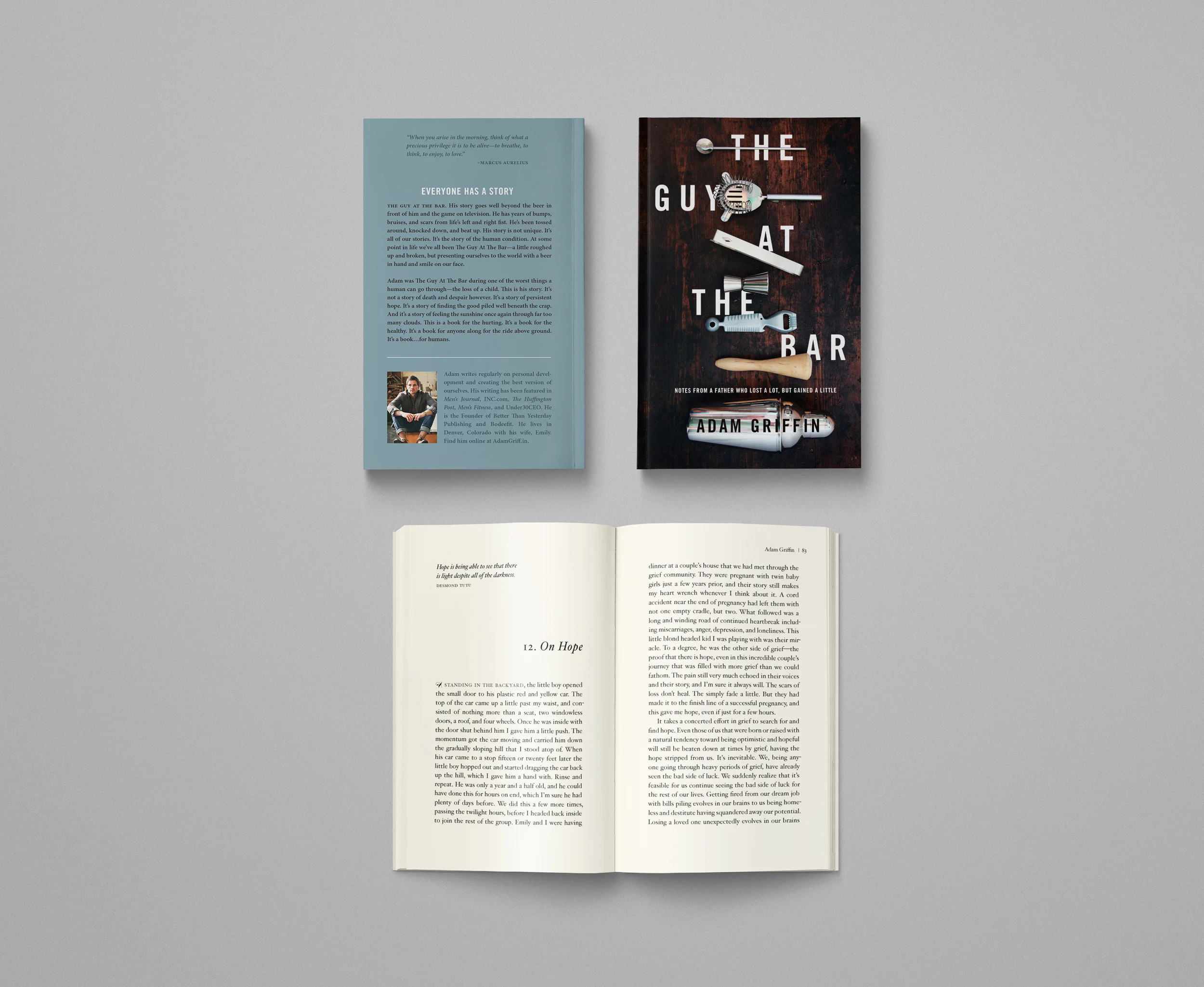
The Character and the Cover Pt. 2
After an initial sketch proved to be too provocative for our liking—that text is just getting too sexy—I moved in a more conservative direction. Initially, I thought the cover should be very colorful, and tried combinations of type and background color that got progressively more vibrant as I moved forward. Ultimately, I decided that my ability to mask the subject's hair would never be good enough for my liking, and moved in the direction of a darker cover with color appearing in the type instead of the background. It was at this point that Emma suggested some alternative cropping on the visuals as well. Having also read the manuscript, she argued, with good reason, that cropping out part of one of the mirrored bodies would create an unnecessary dominant relationship that very much contradicted the concept of presence: that the virtual reality self must resemble the "real" self as much as possible. I put both characters in the frame, leveled and shrunk the type, added some graphic details, including some "cyberlines," and sent the new concept off to Richard.
The Character and the Cover Pt. 1

I've written about designing covers for Eliot Peper before. He's one of those authors to whom I look for advice, not only because he understands and respects my design process, but because he reads the market much better than I do. Since we don't often work for big publishers who dish out on all their marketing secrets, self-publishing authors who do their research remain one of my best sources of information on the book market. I first recognized this characteristic in Eliot while designing the covers for The Uncommon Series beginning in 2013. In responding to the first set of covers I sent to him, he responded with a phrase that would drive me insane for many weeks: "It's just not thriller-y enough." When we got to the point where we were bringing actual guns to photoshoots and setting shit on fire in the streets of Boulder to get the images we wanted, I knew that Eliot's advice, which I had initially balked at, resulted in what remain some of the best covers I've worked on.
On Cover Design — The Making of Cumulus

Getting author approval is only one step in establishing the success of a cover design. Inevitably, the audience will be the ultimate judge, and the research shows that they very rarely follow the "don't judge a book by its cover" adage. Of course, after the cover is finalized, we typically have to wait several months before the book release. It is during that time that I dive into the interior layout and typesetting, a process that I plan to discuss in further posts. This time between cover finalization and actual publication allows me to set the cover design aside for a while, and if, at the end of typesetting, I find the cover is still intriguing to me as the designer, I consider it a success.
On the Importance of Typesetting
Authors who underestimate the importance of interior book design are not alone. Designing the interior of a book is a skill that takes years of training and application, even though the end result is often purposefully invisible to the untrained eye. Many typographers strive for what Beatrice Warde called “The Crystal Goblet,” a term based on her essay of the same name comparing typography to a crystal wine glass. As with the crystal, which functions to reveal the beauty of the wine itself, type is not meant to be noticed—it exists solely in the service of the author’s words. (There are exceptions to this method of typography, of course, but for the interior design of long-form content, Warde’s method is standard.) For this reason, typesetting is often overlooked by readers, authors, and even publishers. Today especially, with the proliferation of electronic books and digital content, typesetting has been further marginalized, since many of these platforms do not respect the design decisions made by the typographer. Still, the importance of professional typesetting cannot be emphasized enough. When the interior of a book is assembled by an inexperienced designer, there is a good chance that type will become noticeable, and not for good reason. Typographers can go on and on about legibility and readability, often to an obsessive degree, but despite its seemingly pedantic nature, the details that typographers obsess over profoundly affect the experience of a text. Although the pursuit of beautifully-set type may not interest the marketing and sales department, authors and publishers do a great disservice to centuries of specialization and study when they choose to ignore the importance of book design from cover to cover.
On Collaboration

In my time as a designer, I have had the enormous pleasure of working alongside some incredibly talented individuals from varying fields of expertise. Some of them I have collaborated with, to enormously gratifying effects. Others I have cooperated with, though I do not frown at these experiences, and many I consider just as rewarding as my collaborations. And so I come to the true intent of this didactic post about creative togetherness. Two extraordinary artists, innovators, and true collaborators with whom I have worked to complete multiple art projects, entrepreneurial endeavors, limited edition artworks, and pitchers of fine beer, have recently struck out on their own in search of personal success. The Frontispiece has been somewhat instrumental in the genesis of both endeavors, though we do not assume to take any credit away from these exceptional individuals. I’d like to spend some time talking about them each, after which I will direct you to their new websites, where you can support them as you have us.
A Meaning-Making Machine

My designer brain obsesses over solutions, and the entrepreneur in me insists that failure is always a healthy option. But, as I have recently come to recognize, imagining “solutions” is also an act of privilege that must be examined. For me, making meaning is very often about locating sources of tension or conflict and striving for a solution. I find a lot of inspiration and self-actualization in the act and effect of solution-finding—this is why I chose to become a graphic designer.
The Public Domain Project
My only copy of Henry David Thoreau’s Walden has been in my family for three generations. Since its publication by Signet Classics and subsequent sale to my young-adult-novel-writing grandmother in 1960, it has been thoroughly annotated, highlighted, underlined, dog-eared, bookmarked, sticky-noted, torn, ripped, taped, and tossed by its many previous owners. Reading it now is as much an exercise of archaeology as it is of comprehension—many of the book’s pages near the point of palimpsest. When I was first assigned the book in the freshman year of my English degree at the University of Colorado, I questioned whether this weathered paperback copy still had any usefulness left in it.
Welcome to The Frontispiece
The Frontispiece started as an idea to launch our own design agency, but recently we made a decision to crop that scope and focus specifically on book design (though we will be accepting work in other areas as well). This choice was not easy, but it was essential to what we as artists stand for: above most else, we believe in the power and timelessness of tangible artifacts—books, records, and artwork.
On Designing Two Books at Once

Over three months after reading Aaron Goldfarb’s The Guides for the first time, I’ve come to the bittersweet realization that my part in the creation of these books has ended. Working with Aaron and the FG Press team to see these books from acquisition to publication has been a real joy. That is not to say, of course, that designing the other books in FG Press’s portfolio was not that, but for me, this project was particularly enjoyable for several reasons. Most notably, the project’s completion resulted in not one, but two full books, with independent identities that nevertheless run parallel to one another. Also, the writing in The Guides is much edgier, and probably more age-appropriate for me, a 23-year-old recent graduate, than some of the other books I have worked on for FG Press.
Graphic Design and Publishing Post No. 3

In my last two posts, I attempted to create a foundation from which amateur designers and non-designers could begin thinking about the form and function of graphic design as it is manifested in their daily lives. With this basic knowledge of the principles of design and using the language presented previously, the reader should be well-equipped to follow me through a discussion of how I go about the design process, from acquisition to final design.
Graphic Design and Publishing Post No. 2
Becoming an educated viewer of design is not unlike becoming an educated viewer of fine art; the knowledge of each subject requires an attention to the history, craft, and principles that guide these fields of study, and indeed, in many places, the study of design and the study of fine art overlap. Design, however, more easily allows for a formalist approach to self-education, meaning that being educated about the principles of design is paramount to an understanding of the design itself. When studying fine art, on the other hand, I would argue that a proper education when approaching an artwork requires a bit more equal weight placed on the history and craft, as well as the guiding principles behind the work. This is not to say that the history and application of design should be ignored—much to the contrary, there is nothing more important to becoming a designer than properly educating oneself about these areas. From the perspective of a viewer, though, design can be interpreted and reviewed through an understanding of CRAP.
Graphic Design and Publishing

Whether you are visiting this page as an author, a designer, or just out of interest, it is important to remember that design forms a critical backbone to a contemporary human society; the form and function of design are what coordinates information and aesthetics with the human experience. The somewhat unfortunate reality of this experience is this: that homo-sapiens are most adept (or at least, most in-tune) with the sensory function of vision. What most contemporary design offers us is the exploitation of trending images, forms, and styles that is mimetic of our seemingly communal aesthetic tendencies in relation to sight. Over the next few posts, I will attempt to outline the form and function of two-dimensional design and seek to challenge the aforementioned “tendencies” that are foundational to contemporary design.