

by Kevin Barrett Kane
The choice to feature a character on a cover design is one of the most troubling decisions a book designer can make. The arguments for and against its use revolve around a question of superfluity—namely, does the use of a human figure rob imaginative agency from the reader?
Peter Mendelsund addresses this issue in his book, Cover, stating:
Put a person on the cover. A frequently winning design tactic, though also tricky—as we designers don't want to rob readers of their satisfying acts of imagination.
Two covers I've designed recently serve as excellent examples of two approaches to the use of character on the cover. Neon Fever Dream, by Eliot Peper, and Presence, by Richard MacManus, are similar books in many ways—they both feature a female protagonist and engage with similar themes of surveillance and growing socio-technological overlap. Realistically, both covers could have ended up looking very similar, as the main themes I sought to convey were objectively comparable. As you can see, however, they turned out quite dissimilar in visual content.

Despite their differences, both covers offer fresh interpretations on the tech thriller genre, and (I hope!) will catch the reader's eye while serving the content of the novels appropriately. In the below paragraphs, I will discuss the design of each cover in detail. But first, since it's not worth discussing separately, I'll highlight one of the first decisions that immediately set the covers up for dissonance: the hierarchy of information. As I've mentioned in a previous post, one initial consideration when designing a cover is the importance of the author's name. For Richard MacManus, this happens to be his first published work of fiction. For his cover, it is theoretically more important to feature the title and visual elements than the author byline, as this information will likely greater influence the consumer's decision to purchase the title. Compare that to Eliot, whose Neon Fever Dream marks his fifth novel. Now, I'm not one to follow this rule strictly, but on the heels of a very successful Cumulus release, Eliot's name offers a bit of cachet that we would be silly not to exploit.

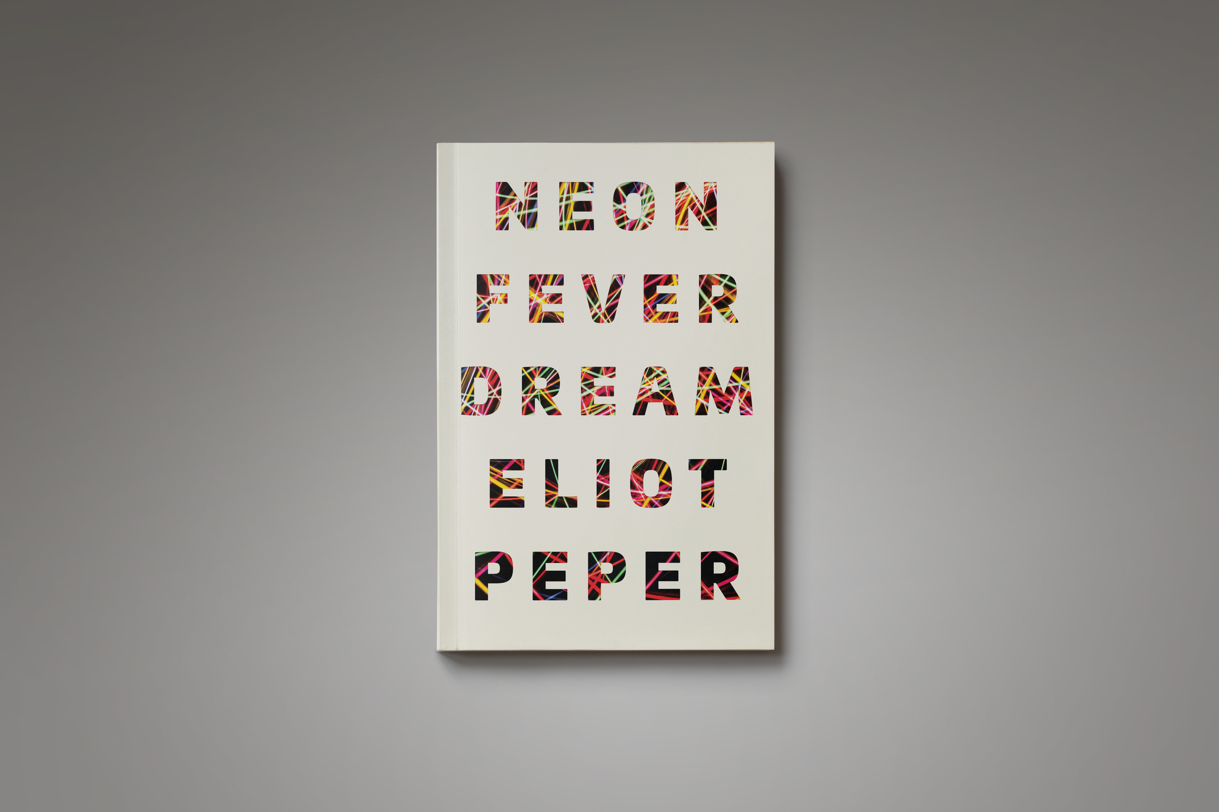
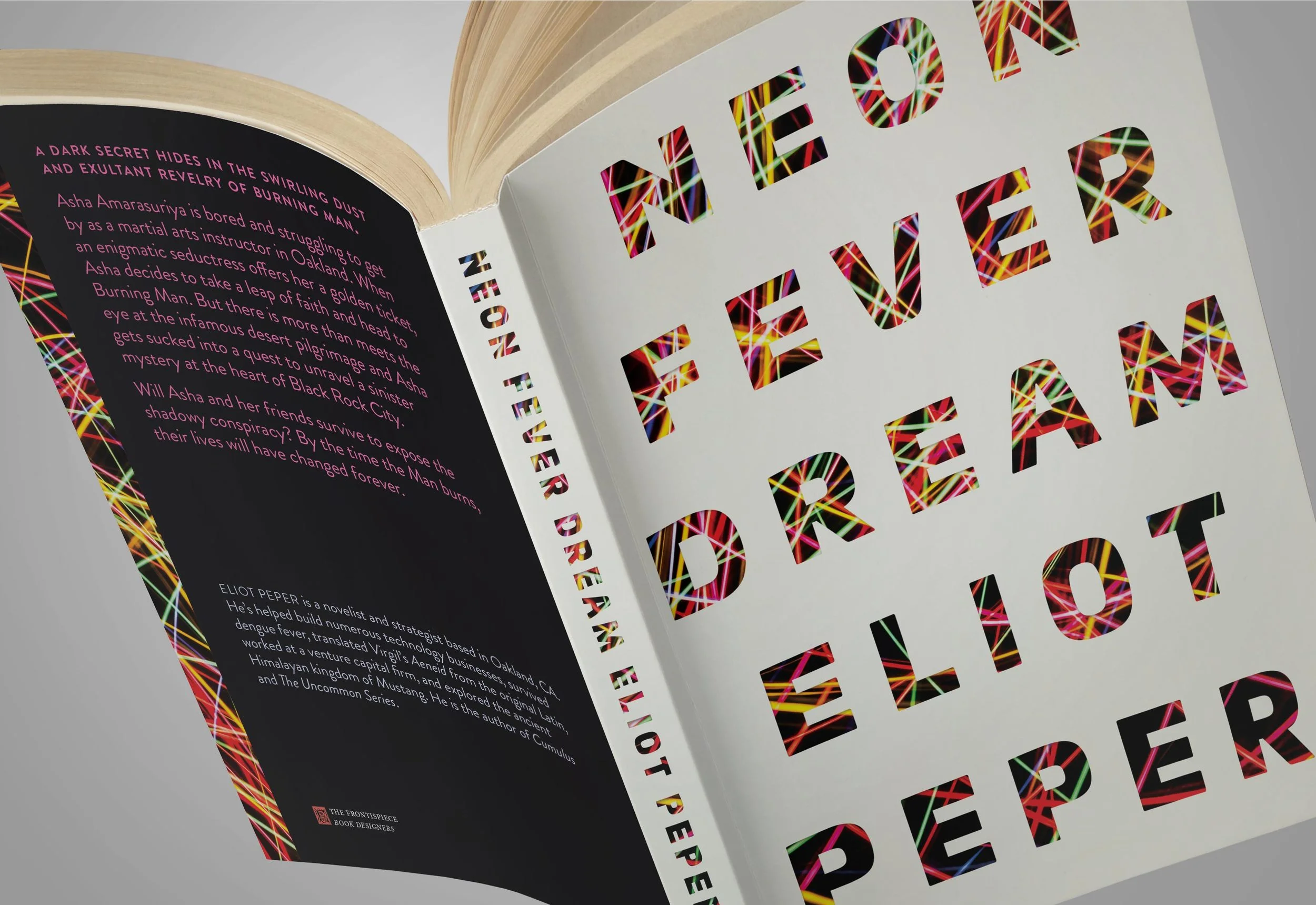
Neon Fever Dream — Eliot Peper (July, 2016)
I've written about designing covers for Eliot Peper before. He's one of those authors to whom I look for advice, not only because he understands and respects my design process, but because he reads the market much better than I do. Since we don't often work for big publishers who dish out on all their marketing secrets, self-publishing authors who do their research remain one of my best sources of information on the book market. I first recognized this characteristic in Eliot while designing the covers for The Uncommon Series beginning in 2013. In responding to the first set of covers I sent to him, he responded with a phrase that would drive me insane for many weeks: "It's just not thriller-y enough." When we got to the point where we were bringing actual guns to photoshoots and setting shit on fire in the streets of Boulder to get the images we wanted, I knew that Eliot's advice, which I had initially balked at, resulted in what remain some of the best covers I've worked on.

Probably could have gotten arrested for this photoshoot.
Have the cover designs gotten significantly less "thriller-y" since then? Some might argue, yes. But Eliot's writing has also gotten significantly more sophisticated. What began as a project to write books about startup nerds disrupting corporate corruption (corperruption?) has grown into a body of work that pushes the limits of the techno-thriller genre in more ways that I can mention. Neon Fever Dream is no exception to this.
When Eliot first briefed me on the new novel, he was only halfway through writing it. Like the prudent author he is, though, he wanted to nail down the cover design early. (I've used this technique repeatedly to get authors excited about finishing their manuscript, and I think Eliot recognizes this in himself. Once a cover is designed, the book seems to be waiting for you to fill it.) As usual, Eliot's brief included the title, plot summary, some early back cover copy, and a moodboard of images Eliot thought might work for the cover. As I'm wont to do, I quickly discarded Eliot's moodboard images as potential covers. They were very good, but I already had other plans. I had been wanting to investigate a type-only cover design for a while, and the richly informative "Neon Fever Dream" seemed the appropriate title to try this treatment out.
My relationship with Eliot is such that I almost always present him with the riskiest designs first, and move in a conservative direction from there. The "risky" cover I had in mind featured a new favorite typeface of mine—Univia Pro—designed by the French typographer Olivier Gourvet in 2015. Univia's letterforms are distinctively contemporary, yet masterfully crafted, appropriately capturing a rounded personality within a more rigid framework. The bold face, in particular, interested me as an elegant typographic solution for the cover. It wasn't long before I'd found an appropriate letterspacing and baseline-baseline distance to fill the whole front cover. I decided to maintain the type through the author byline rather than to separate these elements, figuring I would differentiate elements a tasteful addition of color. From here, I knew that the type was dense enough to work with a layer mask, which is another treatment that I had been wanting to try, and so I went on the hunt for that perfect image.

In-progress design showing the full photograph masked below the text.
It took a while, but find it I did. In a collection by Polish photographer Paweł Michałowski, I discovered a series of long exposure neon light webs that matched my vision for the cover perfectly. Many hours of pixel-pushing later, I had settled on a particularly complex image, which, when situated correctly underneath the text, differentiated the author byline from the title just enough. I wasn't sure how I felt about the design, but decided to mockup a full cover and printed it off for testing.
When the timeline allows, I will often print up a full cover and wrap it around an already-existing book in the office (we have enough, I just have to find the right trim size). At this point, I can slide this fake book onto a bookshelf somewhere and forget about it. I'll move on to different projects, or maybe even take a weekend off. If I come back to the cover a couple of days later and still like the way it looks, I'll send it off to the author for review. When I reapproached Neon Fever Dream, I was almost certain that it would get rejected. Despite any insistence I would make that the image "alludes to the complex web of characters and plot turns," that the masked text "creates a window only through which we can glimpse tiny details of an underlying complexity," and that the non-differentiated title and author byline would not confuse the reader, I was sure that the cover was too experimental for Eliot's taste. So, I sent it off, and hoped for the best.
In typical Eliot Peper fashion, he had some definitive thoughts about the design:
Fuck yeah! I love it. Let's go with this.
Those are seriously some of my favorite emails, ever. I'm lucky enough to have gotten it right the first time on the last two covers I designed for Eliot, but trust me, there have been emails in the past with expletives to the opposite effect—some of the first covers I designed for Uncommon Stock: Version 1.0 come to mind.
So, in all those weeks of designing, the point is that I never once considered including a character on the cover. Was this a conscious choice? Perhaps not. Putting a human figure on the cover is a very difficult approach to get right, and in the case of Neon Fever Dream, I pursued other ideas first. Eliot's characters are very strong and often play ambiguously protagonistic/antagonistic roles, further complicating the choice over which character to feature on the cover. Looking back on Neon Fever Dream, if I were to reconsider the cover design at any point, I would probably opt for an image from the Burning Man Festival itself, which serves as the setting of the novel. But that would be the more conservative approach—one that I don't think would fit the bill for the story inside this book.
Order a physical copy of Neon Fever Dream here.
In Part 2 of "The Character and the Cover," I'll be discussing the design process for Richard MacManus's forthcoming novel, Presence, and taking a look at some of the successes and clichés of science fiction covers in general.
