In my previous post, I introduced the various decisions that go into incorporating the image of a character on the cover of a book. Though there are many different factors that need to be weighed in making this decision, it really comes down to one thing: finding the perfect image.
Using stock photography in my designs is a technique that I purposefully avoid as much as possible. However, there comes a point when my lack of photography skills or access to a professional photographer means there are few other options when looking for that "perfect image." I typically pursue 5–10 concepts for a cover, and I try to limit my dependence on photography to 1–2 of those designs, so finding a couple of good photographs to consider is important, and usually takes me several days.
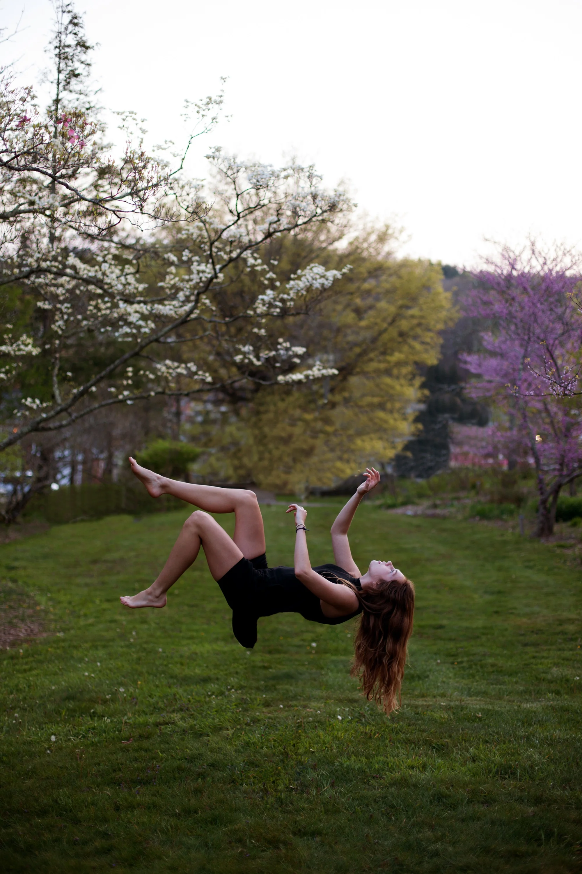
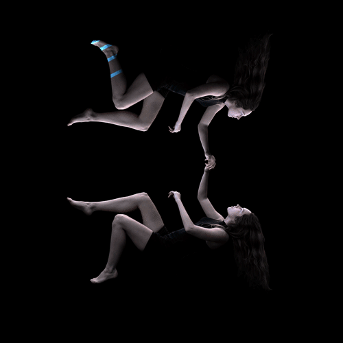
One of my favorite alternative stock photography resources is Unsplash, and I have featured Unsplash photographers on the covers of several of my books, and many more layouts that did not make the final cut. In the case of Presence, I was lucky enough to find the protagonist I was looking for early in my research. The concept for the cover was use a mirroring trompe-l'œil to allude to the nature of the Presence universe, where virtual reality technologies blur the lines between the "Invirt" and the "Inreal." The photograph in question, by wedding photographer Ashley Bean, features a girl suspended in midair, her expression one of fascination rather than fear. It was her outreached arms and the top-lighting that got my attention, and once I started working with the photograph, I knew this concept would likely be a strong contender. I had some work to do, removing the background and jewelry, and working with the image's levels, but I was lucky enough that the photograph provided was high enough resolution and that the subject was perfectly in focus.
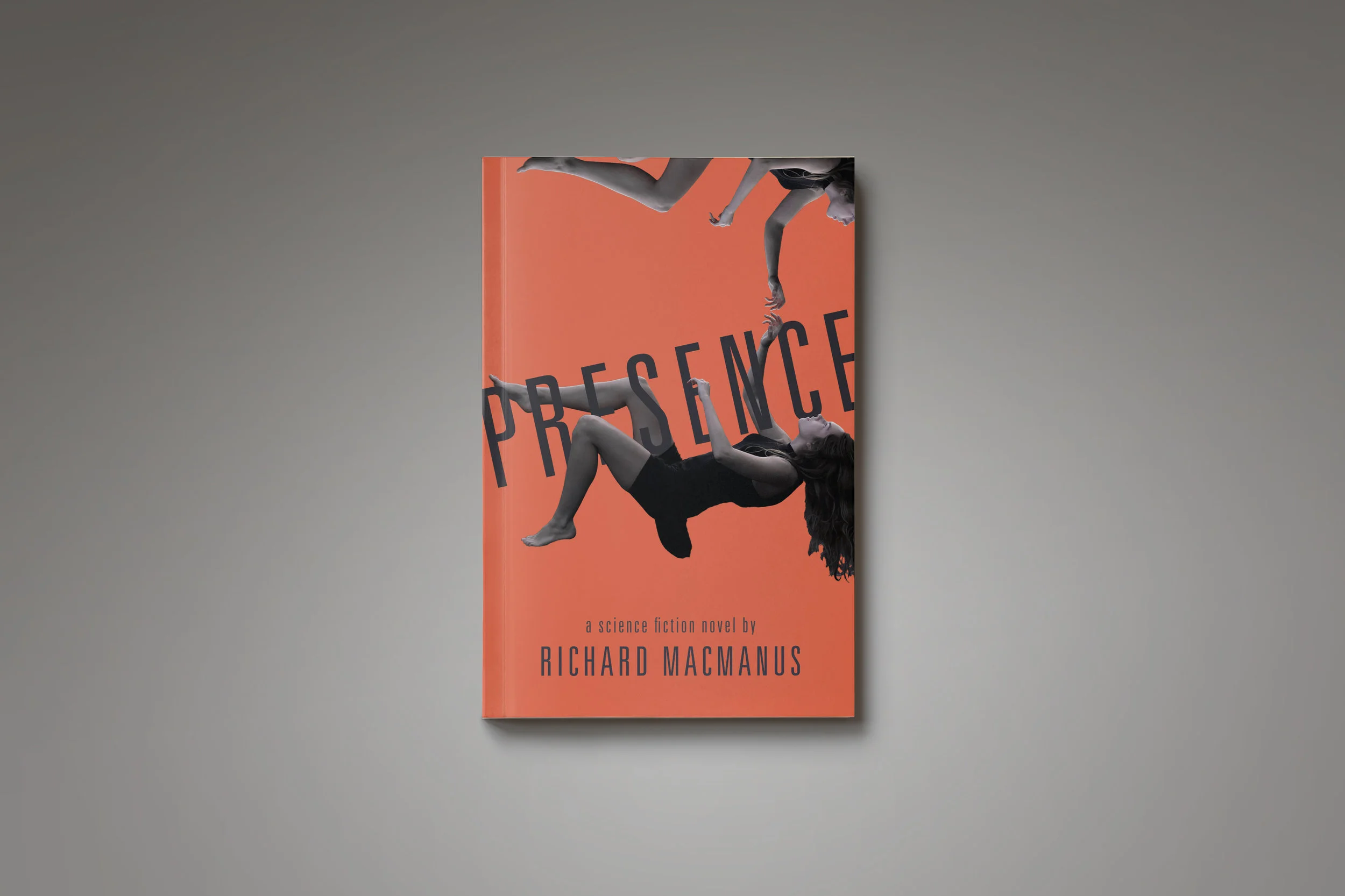
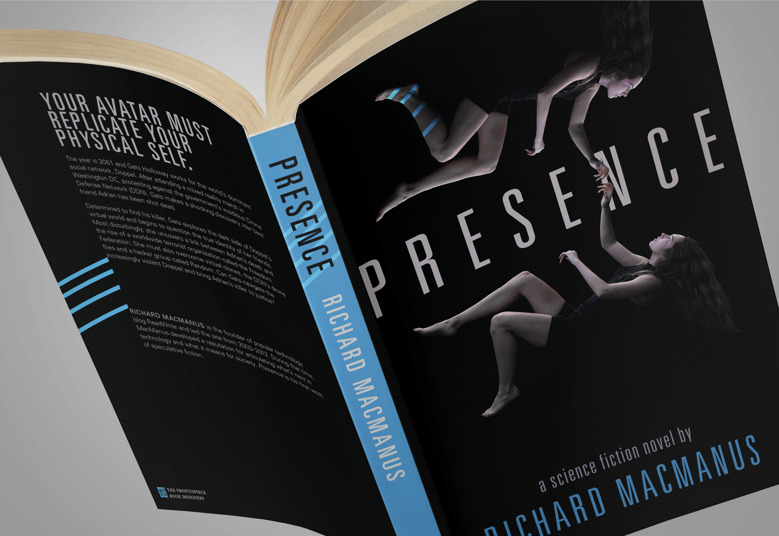
After an initial sketch (right) proved to be too provocative for our liking—that text is just getting too sexy—I moved in a more conservative direction. Initially, I thought the cover should be very colorful, and tried combinations of type and background color that got progressively more vibrant as I moved forward. Ultimately, I decided that my ability to mask the subject's hair would never be good enough for my liking, and moved in the direction of a darker cover with color appearing in the type instead of the background. It was at this point that Emma suggested some alternative cropping on the visuals as well. Having also read the manuscript, she argued, with good reason, that cropping out part of one of the mirrored bodies would create an unnecessary dominant relationship that very much contradicted the concept of presence: that the virtual reality self must resemble the "real" self as much as possible. I put both characters in the frame, leveled and shrunk the type, added some graphic details, including some "cyberlines," and sent the new concept off to Richard.

In between some clarifying questions about image-use and further details about the cover's final appearance in print, Richard had this to say:
I really like the black and 'computer blue'. Also the four blue lines that run across the black cover, across the spine, and onto the mirror image's leg is a brilliant touch—nicely conveys that the mirror image is virtual. The two complete images of the woman is also a plus [compared to an earlier design in which one figure was cut off]—and she does bear a striking resemblance to how I envisaged Gats, [the protagonist].
The capitalization of PRESENCE also works really well. There was a reasonably popular nonfiction book called Presence recently, but it doesn't use capital letters. Also that's another good reason to go with the black cover, as that other book has a light colored cover. [...]
Fantastic work so far and I'm really enjoying this process!
I can be a bit of an over-explainer, and so responses from clients like the one from Richard are always a pleasure to read. It was clear that with Emma's help, I had honed in on certain aspects of the story nicely and that the concepts driving the cover design spoke for themselves. We were also lucky enough to design the interior and eBook files for Richard's book, which released this week. The novel is a truly extraordinary work of science fiction—one that considers the potential future of virtual reality, and future socio-technological conflicts brought about by developments of social media and surveillance. Pick up a copy of your own to support another remarkable self-publishing author here.