
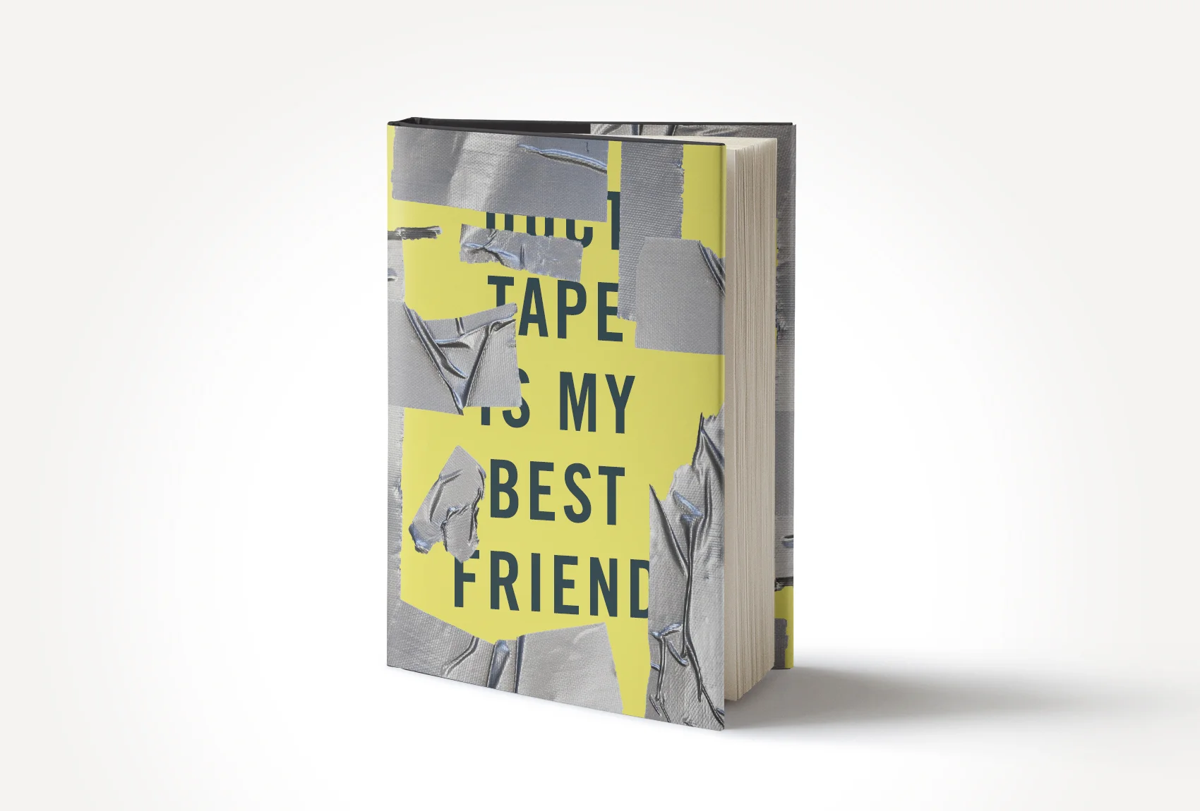
Many of us know a person who DIYs everything. If there’s ever a problem, they come equipped with duct tape, a mop bucket, and Windex. They’re scrappy. They save money. And their work is a great temporary fix. It might keep your kitchen from flooding for a week. But anyone can look at a DIY solution and tell it from a professional one.
When it comes to designing a book cover, leaving your duct tape showing can completely delegitimize an otherwise excellent book. DIY design solutions seldom work if you do not already have the appropriate experience and tools.
Almost all self-publishing resources will recommend that you hire a designer—specifically one familiar with publishing—to produce your cover design. Great designers make design look easy, and great covers often appear effortless. But like any other professional work, they are anything but, and preparing them for print production or digital upload is even less so.
Despite this advice, many authors believe in the power of DIY. This is a resource for those authors.
For those of you who prefer to hire an expert the first time around or find yourselves stuck mid-DIY, here’s our card.
Design is hard. But sometimes you need to try your hand at it to figure that out.
–
1. Know your market.
Many self-publishing authors sell their book through Amazon.com. Frequently, authors that we work with fantasize about having their book on the Best Sellers’ List for their genre, and send us covers that they like from the page. Looking at your genre page on Amazon is a great exercise for more than just visualizing your own success. It can help you see design trends in that genre, and help you to avoid copying an already successful cover.

If you're writing a book for adolescents, you'll likely want to stick to hand-drawn typography, but you may avoid that particular shade of blue featured in R.J. Palacio's two best-sellers, Wonder and Auggie & Me.
Be different, but don’t confuse people. You don’t want your sci-fi novel to be confused for a self-help book or vice versa.
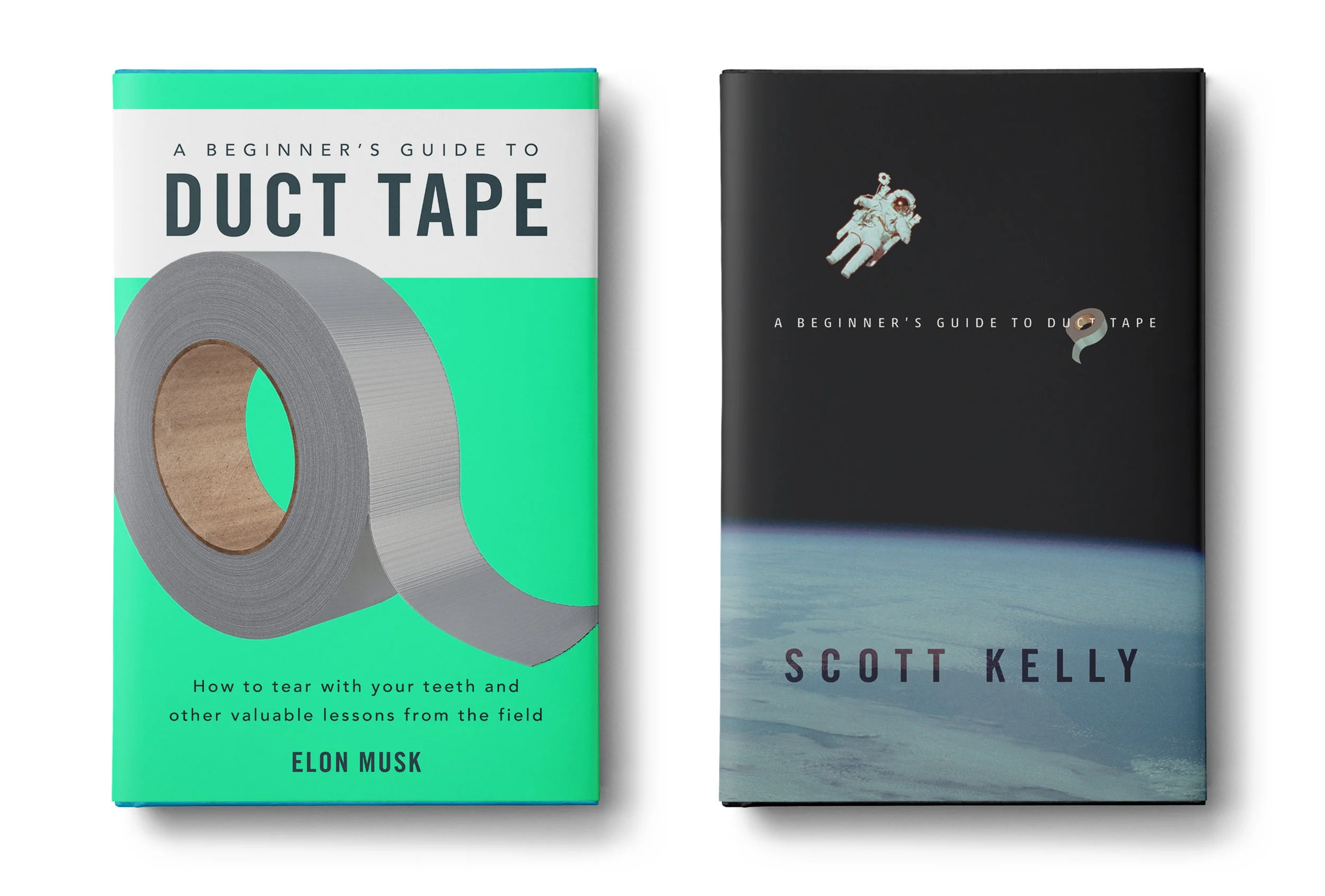
Both of these hypothetical covers are working in certain ways, but each would probably be better-suited for a specific genre.
2. Less is more, especially when you don’t know how to do more.
Design is not necessarily intuitive. But recognizing good design can be.
Even covers that appear to be simple can be much more layered than you think. A seemingly minimalistic cover showing a hand holding a red apple could be the result of an entirely different image, manipulated by a designer to achieve a desired effect.

Creating this cover requires cropping and rotating the original image, removing details from the background, applying a hue/saturation adjustment layer, and using a clipping mask on that layer to prevent the hand from turning purple when turning the apple red.
Do your best to find one image that accomplishes what you need for your cover. The more you need to piece together, the more your lack of professional training will show.
Make sure you use a high resolution image. Images under 300 dpi are not suitable for print, and will appear pixelated or out of focus.
3. Do your “photo” research.
If you only take away one thing from this article, let it be this: you cannot use just any photo on the internet. The difference between two different images can be the difference between getting sued. If you're not sure whether or not you can use a photo, do not use that photo.
Fair use does not apply to most books. And even if you feel like you could win a copyright case in court, do you really want to go to court if you can avoid it?
To learn more about all things photo licensing read here.
4. Your favorite font is probably not the right font.
Unless you are a design nerd, you probably don’t have a particular passion for the subtle differences between Stempel Garamond and Berthold Garamond. It takes a fair amount of training to foster an awareness of the subtle differences between typefaces. As a non-designer, the fonts you notice are probably just that: noticeable. And despite what you might think, you rarely want the type choices on the cover of your book to be the first thing someone notices.
Low hanging fruit in the attack on typefaces would be Comic Sans and Papyrus, which do have appropriate applications you can read more about here, but most other fonts you will find in your Microsoft Word font library are not going to make the cut either.

If you find yourself saying that a font is "fun" or that it communicates something about your book, it’s probably time to let that font go. Having your font explain your book is like explaining the punch line of a joke. It ruins it for everyone.
5. To serif or not to serif, that is the question
This takes a bit longer to explain. Click here to learn more about typography basics.
6. Test it in Thumbnail and B&W (Do your own quality control testing)
As a self publishing author the majority of your sales, whether digital or print, are going to take place on Amazon. Unlike a bookstore where you encounter books in their actual size, on Amazon and the majority of online sales platforms, your book will be represented at postage stamp size on a screen. Your cover needs to be highly visible and readable at postage stamp size as well as in its final printed format.
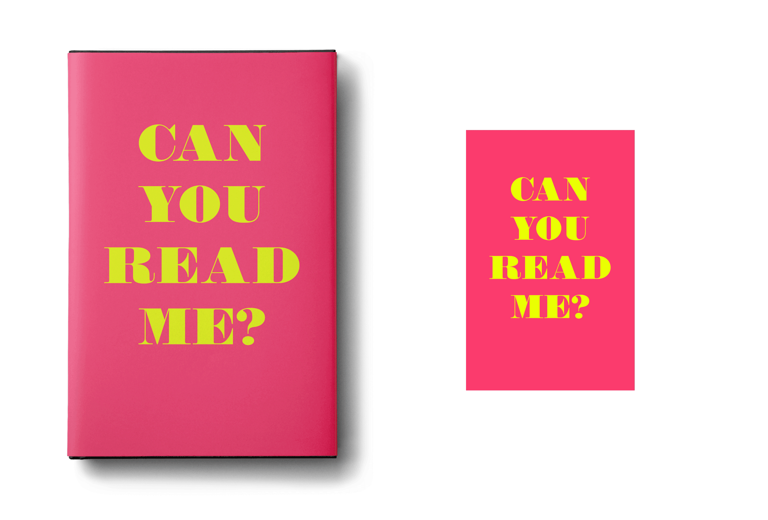
Believe it or not, the greyscale version of this very bright pink and yellow cover design is hardly visible. The chosen typeface, though working well in a larger format, quickly diminishes in legibility at smaller sizes.
If you plan to publish digital editions, not only does your cover need to look great as a thumbnail, it also needs to stand out in black and white. Check your design in color and in grayscale before you commit to a color combination. It could be a deal breaker—it's very often the deal breaker in our own designs.
–
If you've followed the above recommendations, you’ve probably been able to piece together a passable cover design. Now all you need to do is translate that cover into a full mechanical design (front cover, spine, and back cover); write some compelling and marketable cover copy; design print-ready files for your book's interior and proof for additional errata including widows and orphans; ensure all images and graphics are in the appropriate colorspace and high enough resolution for print; calculate the spine-width based on the number of pages and paper stock; choose a binding and production method; decide whether or not to order an offset print-run based on perceived number of sales; upload all appropriate files to your chosen print-on-demand, offset, and digital suppliers (yes, they all require different file formats); purchase ISBNs and barcodes and ensure your copyright information is accurate; list your title online using the most accurate BISAC Subject Codes; choose the best keywords for guaranteed traffic on your listing; and even after you've completed all these steps, most of which often require multiple rounds of troubleshooting, you still haven't even begun to market your book—an entirely separate and equally convoluted process.
If you're feeling extremely overwhelmed at this point, you still have our card from before, don't you?